UX DESIGN INSTITUTE / COURSEWORK
This project was part of the final assignment at UX Design Institute
My Role:
User Research
Prototyping
UI Design
SUMMARY
The task was to create a medium fidelity prototype for a chosen hotel booking website.
Assignment goals:
Define problems of the typical hotel booking websites
Improve user flow and define clear and smooth navigation throughout the website
Create interaction design that triggers positive emotions
Create a website that is perceivable, predictable and easy to use
Improve overall user experience
PROBLEM STATEMENT
Booking an accommodation should be a straightforward exercise. Especially as it is such a common activity and there are thousands of booking websites used everyday. However, when competitive benchmark, survey and usability testing exercises were completed, a common issues with the booking websites were found:
overwhelming amount of graphics and information
website too difficult to navigate
it was hard to compare the hotel options, user would get lost when opening each hotel in the new tab
too many clicks and too much scrolling was identified as an issue
photographs that are not realistic, and customer would get disappointed on arrival
price that fluctuates when moving towards the final booking
compulsory registration in order to complete the booking, confusing registration process
no error message if customer details are not filled in correctly which means booking cannot completed, but user is not aware why
and even customers who find out on arrival to their booked accommodation that no booking was actually made!
To summarise, the experience of booking travel accommodation that should be exciting and inspiring was found to be quite the opposite - stressful, frustrating and time consuming…
PROJECT GOOALS
Create a layout that is clear and simple
Find and eliminate bugs that make customers drop out of the booking.
Make user feel confident and secure about their booking
CREATE A POSITIVE EXPERIENCE !

APPROACH
To determine statements listed above the following research methods were used:
COMPETITIVE BENCHMARKING

I have chosen to review 4 competitors’ (2 direct and 2 indirect) websites to understand how the best-in-class websites work
• Understand the conventions
• Highlight strengths and weaknesses
• Summarise the findings and provide lessons learned.
My review focused on 4 components of the web:
• Homepage
• Search engine
• Room selection
• Completing the booking
Interesting fact: while doing this exercise one of my chosen hotel websites was not displaying error message which made me wonder why I cannot proceed to the next step. The lack of inline validation and error messages left me irritated and I was considering choosing another competitor since I could not understand how to progress to next step.


SURVEY

The survey was designed to get insights into peoples` habits in booking hotels and understand existing pain points when using hotel booking websites or applications.
The summary of the results presented below:
• 21 responses were received. Majority of the respondents were 25-34 year old.
• 52% of respondents visited hotel website or app more than 4 weeks ago.
• Equal number of respondents visited the hotel app/website because they wanted to book a room or compare rooms and rates to other hotels. Small number of participants were looking at current offers.
• Majority of the respondents were able to complete their task successfully.
• Majority of the respondents used Booking.com to book a hotel .
• Majority of the respondents used website to book a hotel instead of app.
• Most common reason for booking a hotel is holiday and visiting friends and family.
• Price and location were top priorities when booking a hotel room, following reviews, cleanliness and appearance.
• When asked what would changes would respondents make to the hotel booking website/app many answers focused on making it easier to compare rooms/ hotels as well as providing realistic photographs of the room.
• Many respondents mentioned that many times when they booked a hotel room online in reality it did not meet their expectations, it looked better in the photographs

USABILITY TESTING

During the usability test I found out about the pain points of visual clutter, hardships of comparison and filtering as well as emotions that seemingly simple booking process can recall. The most important for the booking website call to action button was missing that made the participant doubt themselves!
AFFINITY DIAGRAM

Affinity diagram workshop was run online using the MIRO boards. In less than 3 hours we organised the research outcomes described above into various categories and came up with objectives.

CUSTOMER JOURNEY MAP

Affinity diagram heavily contributed to the process of establishing customer journey. Clear pain points for the user was filtering, cluttered and unclear hotel info page, annoying add-ons and sometimes payment process.

RESEARCH OUTCOMES
Increase website traffic: keywords, add website to online directories, use compelling titles
Make website mobile devices friendly and vice versa
Only essential text, short graphic information, highlight the key information
Calendar to have minimal clicks and add prices for customers looking for flexible trips and offers
Information on discounts and offers to be clear: dates when applies, prices.
Have a map with pinned hotel locations and essential info: quickly flick through images, price , location.
Create an opportunity to shortlist potential options for registered users ‘‘Favourites” tab
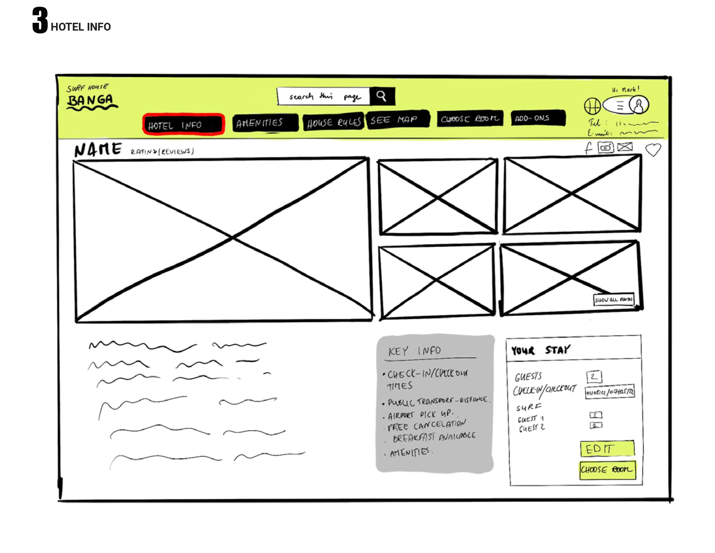
Concise and just essential information about the hotel. Pictures say more than words.
Have interactive map next to hotel description
Proximity to the city centre, transport links, closing times of amenities , local attractions, are important for the customer
Create a feed (for example instagram) where current guests could share their pictures . Or allow add pictures in reviews
Concise and just essential information about the room:
Information to be specific to the room
Breakfast and cancellation policy should be within the room rates.
Make sure customer can see final price all the time
Important add ons like breakfast free cancellation, airport shuttle could be next to room description when selecting rates. Other add ons could be selected after booking or sent by email.
Make sure booking details are visible on one page all the time- no scrolling
.Ensure final price and booking details- dates, times what is included what is not are clear.
Ensure confirmation of booking is sent to the customer after reservation is made.
If information is not filled in correctly , error message should always be shown.
Offer the membership - clearly state the benefits
Create a feed (for example instagram) where current guests could share their pictures . Or allow add pictures in reviews.
Make sure when user share information on social media and copies the link , the key image that appears is representative of hotel brand.